Monday, May 18, 2015

Photos that could be improved.

1.

While this photo is nice, it could be improved in many ways. Firstly, if the photo was more in focus, that would help. The background should not be as visible as it is. It distracts from the focus. It would be better if I had set up the camera a bit higher. 

2.

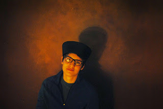
This photo is bad because Weston is overexposed, the background is far to visible, and it needs to be cropped. It would be better if the lighting were better and it were cropped. I could live with the waves of the background. I almost like them!

3.

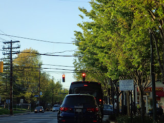
While this photo is good in the sense that I used a worms eye view, it lacks in color. The sign dark and the background is light. While this photo uses great depth of field, it lacks the focus on the sign. Which I wanted to capture. 

My Best Photos for the Year!


1.

I think this photo is a fantastic image with cool colors that make her stand out from the black background. Purple and orange nicely compliment each other. I could improve it by possibly using a composition guideline. Though I think this image is fine the way it sits. It is simplistic and balanced.

2.

This photo of Alain is very similar to my first one. It is very simplistic and shows off Alain's eyes and his sense of style very well. The curved lines of that hat and bright colors contrast the Dark black background. 


3.

Using a color filter on this shot really helped give the background a cool almost painted feel. Daniel's skin is even and the shadow gives of a sense of meaning. The background is non cluttered and his outfit is simplistic, helping the photograph shine.